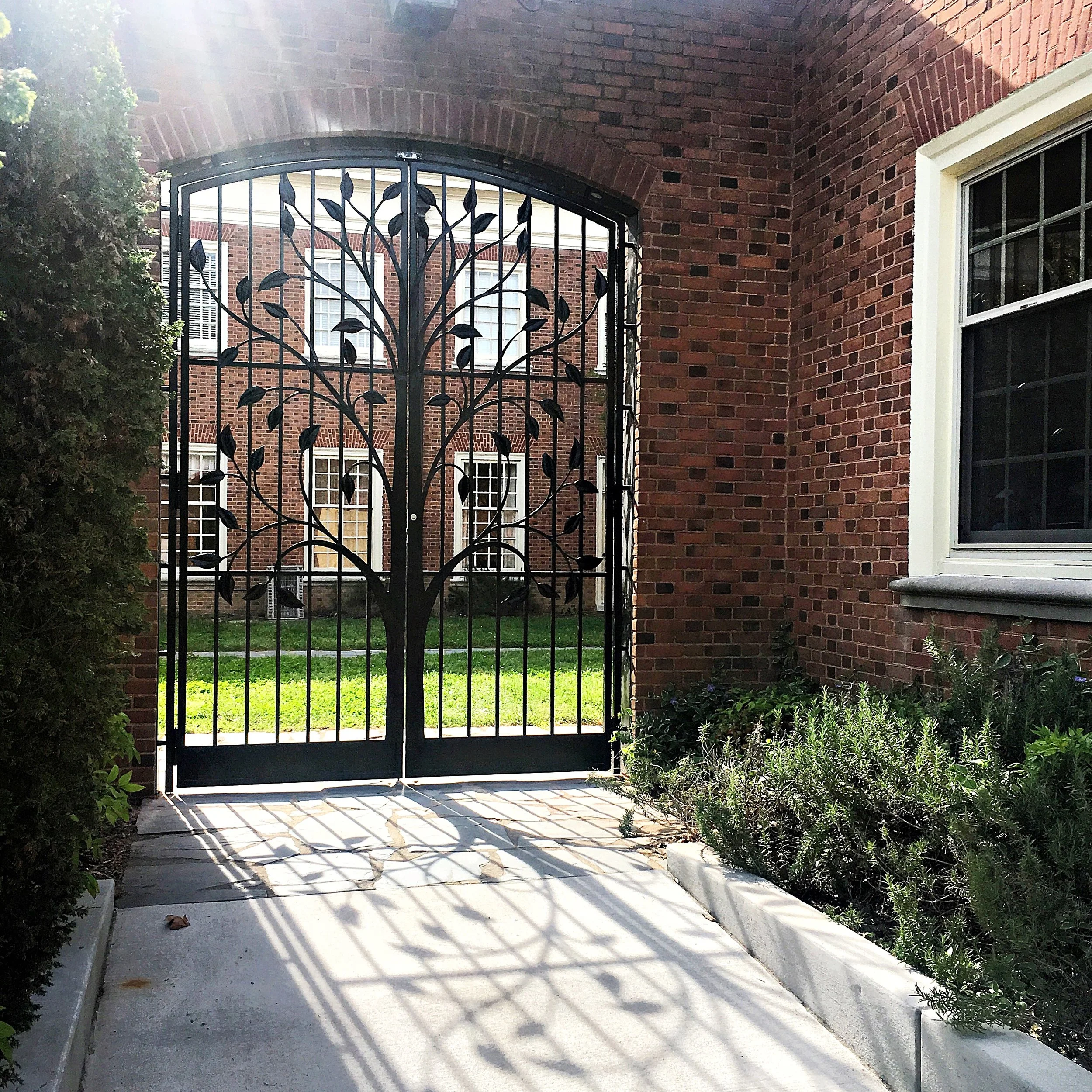
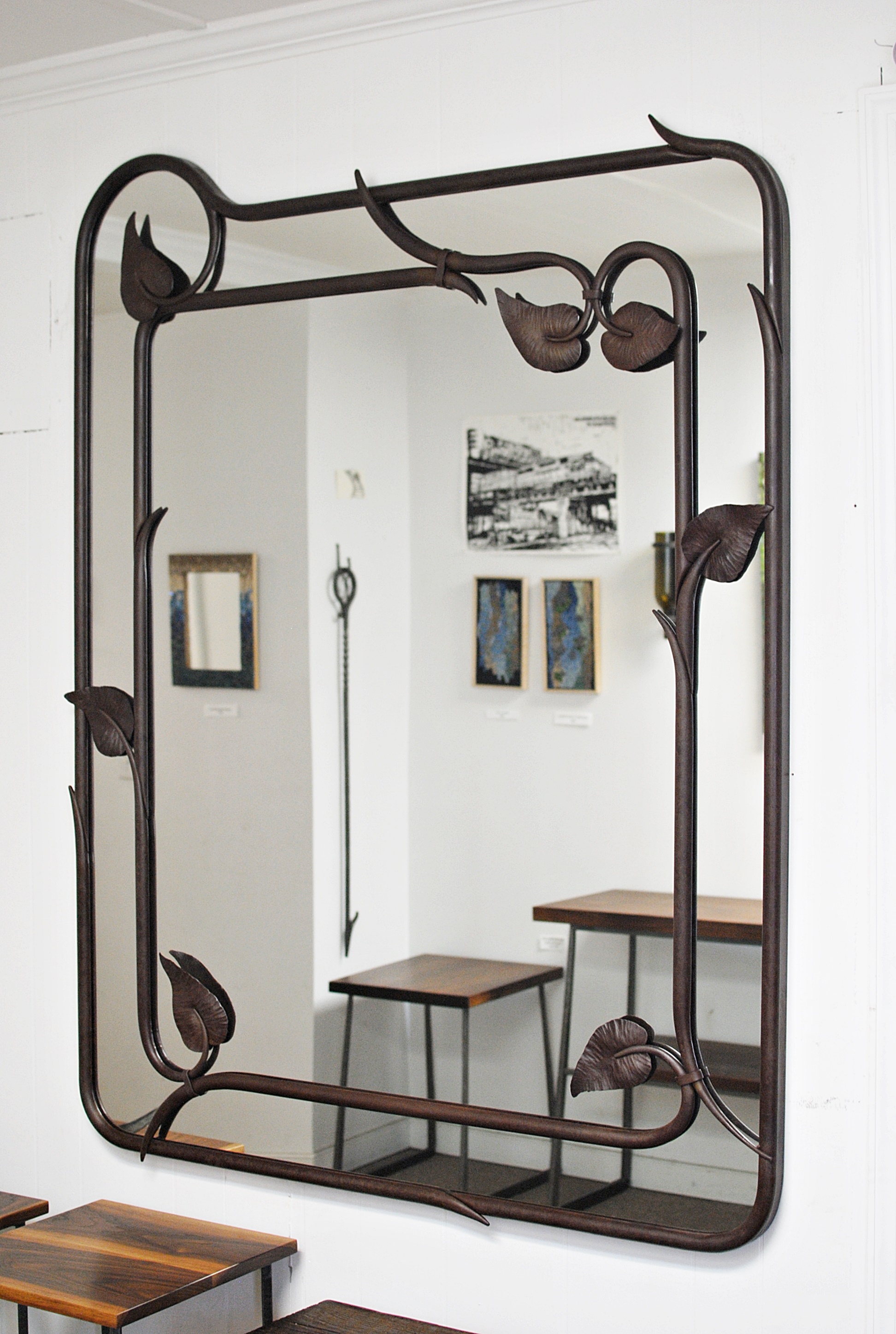
Sculptural Screen

This client approached us with an exciting project: creating a large-scale custom garden sculpture for their yard. The resulting sculptural screen is forged steel with a rust patina finish. The design was inspired by the curving paths and curling bark of the trees in the client's garden.

One of the first steps in a project of this scope is to create a mock-up or test piece. Kyle’s foot is included to show the scale of the material for this piece. The stock is quite a bit heavier than we usually use!

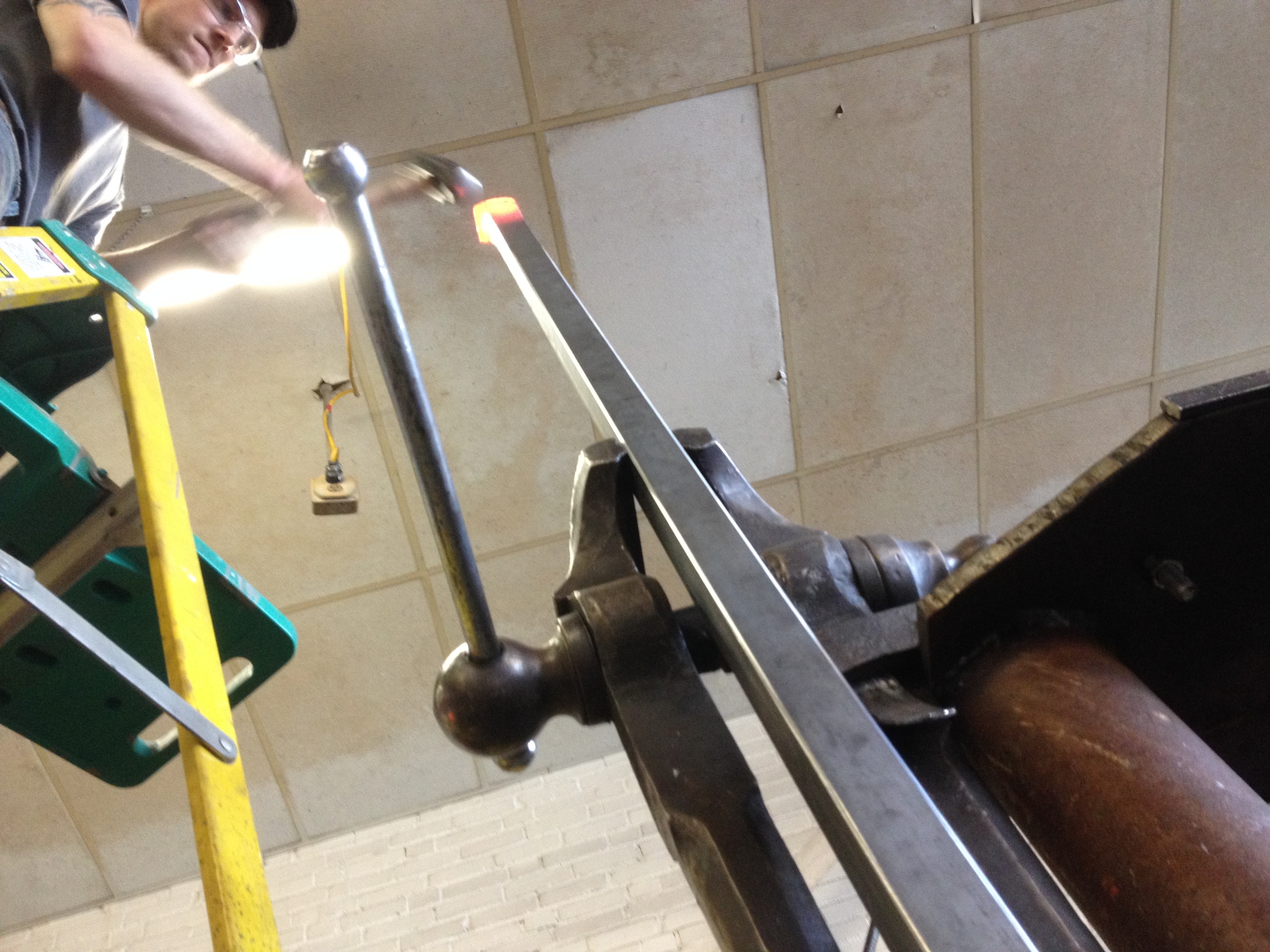
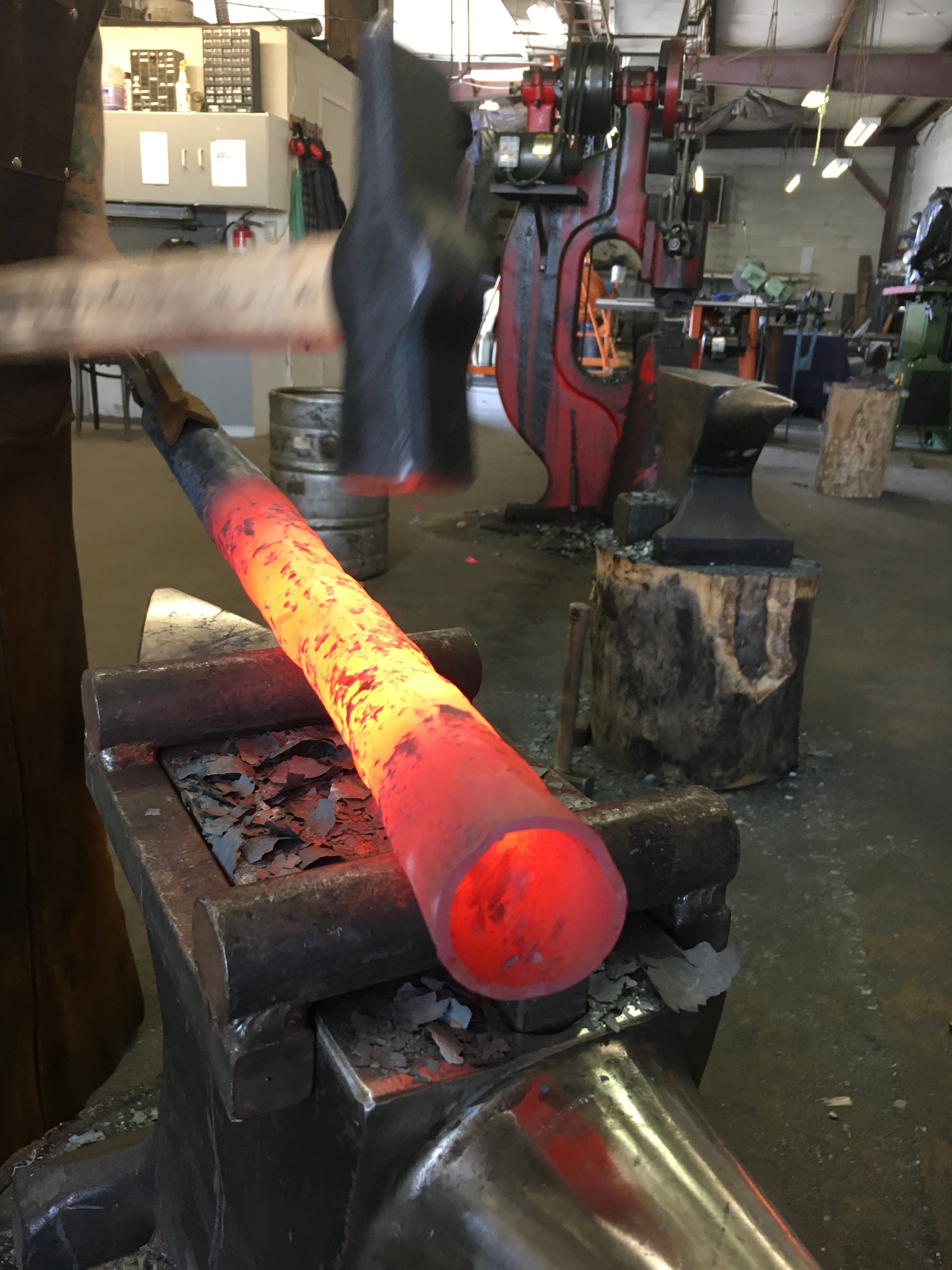
The design incorporates a process known as “upsetting” on the 6' posts. Upsetting is a forging technique that involves bringing the material back down on itself to make it larger than the original stock. Usually we can do this closer to the ground, but in this case the height required climbing a ladder to get the best results.

The completed posts with a quarter shown for scale.

Next we shaped the horizontal curved pieces, then clamped them in place on the screen. Once all the pieces were locked in, we used a torch to cut them to varying lengths, creating a sense of rhythm and balance.

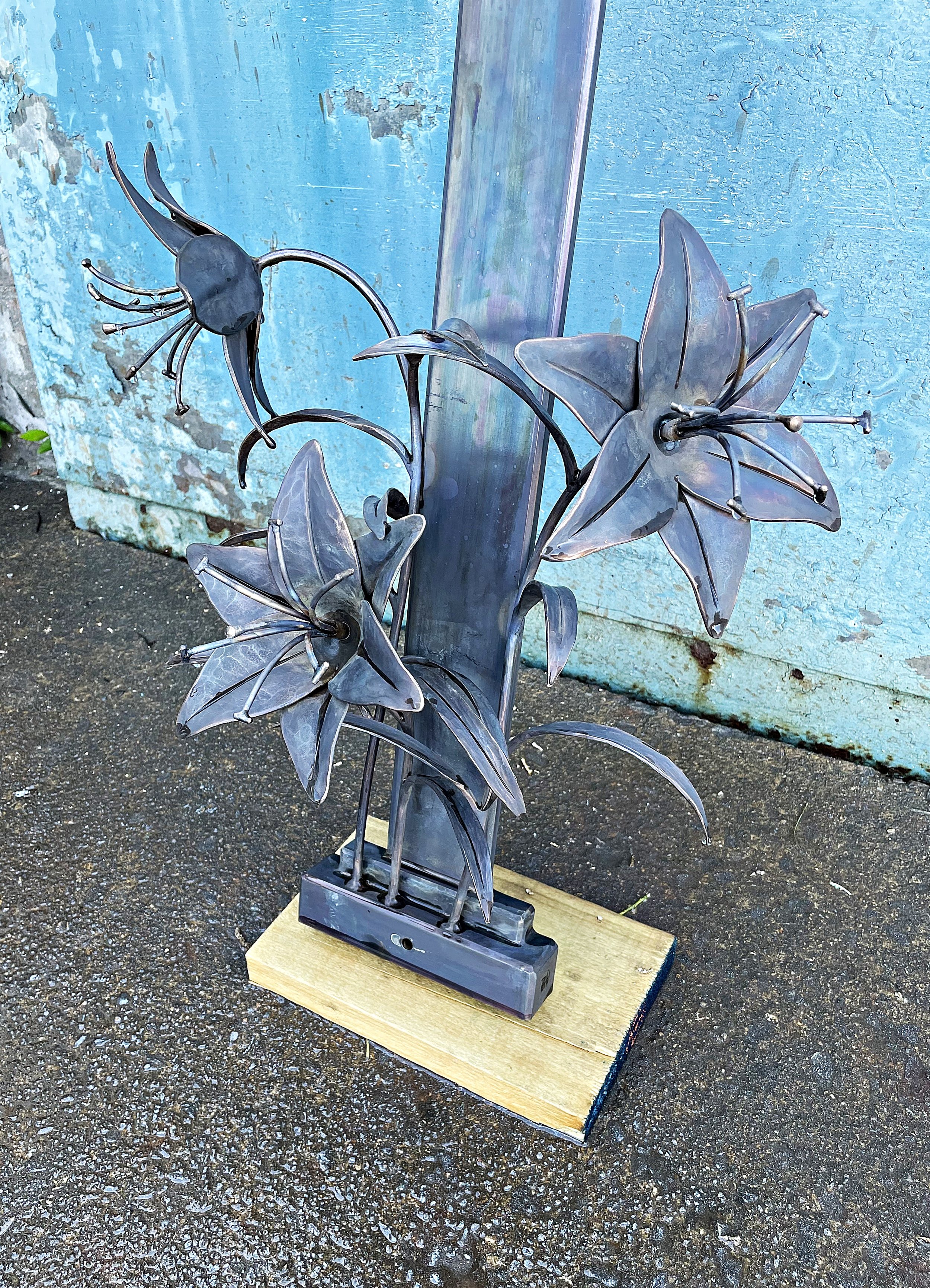
A few detail shots of the custom sculptural screen before installation to show the rich texture and dimension.

Go Bike! Community Art Project

If you're in Richmond, you know the city is a whirlwind of preparations. The 2015 UCI Road World Championships are coming in September and there is much to do! One project we're excited about is the ie* Go Bike! community art project. This project consists of 30 collobarations between local artists and identical sculptural castings. The sculpture itself was designed by VCU student John Sampson to reflect the city of Richmond and the international bike race. Johannah was thrilled to be selected as one of the artists for this project.

First step to ready the sculpture for paint and mosaic was to clean it. Next we sprayed it down with an aluminum sealer. Once that was complete, I could start playing with lines and color for the design.

A string of events inspired the design for this piece. Last summer, I created a series of mosaic maps of the Richmond area. Soon after, I was excited to learn of a research project created by Housing Opportunity Made Equal (HOME) called Mapping RVA: Where You Live Makes All the Difference. The maps used in this project reflected many of my thoughts about Richmond while working on my own maps. When the proposal for the bike rack project came through not too much later, I immediately knew the HOME maps would be the foundation for my project. (See the top right corner of this photo.) One side of the bike rack is based on the Educational Opportunity map, while the other is based on the Housing Opportunity map.

There were so many new challenges with this project. From finding an exterior-grade adhesive for bonding non-porous glass and aluminum, to the visual and physical logistics of combining paint, glass, and grout, to painting letters. I have a much deeper respect for sign painters these days!

Though I would have loved to cover the entire piece in mosaic, time was short for mosaic. I think the final combination of paint and glass turned out to be one of those happy accidents in art. Still, it was a challenge to my self-confidence to put a painted work (not my primary medium!) out into the world. 

By September, the bike racks will be installed separately around the city. But first they're being exhibited all together at the Virginia Museum of Fine Arts for three weeks. On the day of the opening reception for the exhibit, I awoke to the surprise of finding myself on the front page of the local paper! I expected this story to be buried deep in the arts section. This was just the first indication of how excited the city is about the bike racks. I think the community spirit and group effort have a lot to do with the great reception. One of the many reasons I'm honored to be a part of this project.

I'm pretty excited to have my art work in the same space as not only 29 other great local artists but also world-reknowned artists like Jun Kaneko (middle photo) and Dale Chihuly (right photo). The show comes down next Monday, July 6. Stop by the VMFA sculpture garden this weekend for one last chance to see these beautiful works of art together in one spot!

Processional Cross

The pastor of a local church recently visited our booth at a craft show. After taking it all in, he realized our work in metal and mosaic was just what he needed for a special project. His church was about to celebrate their 50th anniversary, and they were hoping to commemorate the event with a new processional cross.

The first step in designing the cross was to visit the beautiful sanctuary of the church. We noticed several elements that we incorporated into the final design, including the golden color of bronze, radiating lines, and the colors and style of the stained glass window over the altar. For the final design, we settled on a bronze cross with a crown of thorns around the arms of the cross. The center of the cross would be translucent mosaic.

To begin the project, we had to create stock for the bronze cross. Unlike other metals, there aren't many stock sizes available for bronze. To get the specific size we needed for the cross, we fabricated it from bronze sheet metal. 

We used our life-size drawing of the cross to make a hard template from MDF. We were then able to fabricate the bronze frames around the hard template. Eventually the three frames would sandwich the acrylic that would support the mosaic.

Next we twisted two thin strands of bronze round bar around each other to create the crown in four sections. The thorns were forged separately from bronze and welded in place.

The completed and polished cross with the acrylic installed and waiting on the mosaic.

The octagonal base with curved sides was designed to fit with existing elements in the church. This is a complicated shape to fabricate. To determine the correct size for each panel, we created a series of templates and test runs, first in paper and then aluminum. Once satisfied with the results, we transferred the pattern to the bronze. The final eight bronze sections were shaped, welded into place, and polished to a bright finish.

Finally it's time for the mosaic! Using the life-sized drawing, we traced the shape of the figure onto the acrylic. The style of the figure was drawn from existing images of Christ in the sanctuary. Rather than overtly placing the figure on the cross, we suggested the shape of a body through grout lines. The color selection of the mosaic draws on the red cross and blue background of the stained glass window. We worked with material that was translucent so that, unlike most mosaics, the cross transmits light. Once the first side was glued in place, we flipped it over and repeated the design exactly on the back to keep the colors unmuddied. Last of all, we grouted the mosaic on each side.

The cross frontlit and backlit. Frontlit, the lines of the figure show through, and light glints off the mirror-back and iridized material. Backlit, light glows through the transparent material. The ever-changing relationship of light with mosaic is one its most appealing qualities, but it also makes it nearly impossible to capture in a photo!

The completed processional cross in our studios. The staff was turned by a member of the congregation. We delivered the cross just in time for it to be dedicated during the Easter morning service.